library(tidyverse)library(tapModel)library(LaplacesDemon) # for mode and rbernlibrary(knitr)library(kableExtra)library(cowplot)data(wine)# ordinal data sets corresponding to the repeated measures designwine1 <- wine |>filter(trial ==1)wine2 <- wine |>filter(trial ==2)
1 Example: Wine Ratings
The wine ratings came from private correspondence with the author of Hodgson (2008). Here’s the abstract of the article.
Wine judge performance at a major wine competition has been analyzed from 2005 to 2008 using replicate samples. Each panel of four expert judges received a flight of 30 wines imbedded with triplicate samples poured from the same bottle. Between 65 and 70 judges were tested each year. About 10 percent of the judges were able to replicate their score within a single medal group. Another 10 percent, on occasion, scored the same wine Bronze to Gold. Judges tend to be more consistent in what they don’t like than what they do. An analysis of variance covering every panel over the study period indicates only about half of the panels presented awards based solely on wine quality.
The data comes from a wine-judging event, where (p. 106)
[F]our triplicate samples [are] served to 16 panels of judges. A typical flight consists of 30 wines. When possible, triplicate samples of all four wines were served in the second flight of the day randomly interspersed among the 30 wines. A typical day’s work involves four to six flights, about 150 wines. Each triplicate was poured from the same bottle and served on the same flight. The overriding principle was to design the experiment to maximize the probability in favor of the judges’ ability to replicate their scores. The judges first mark the wine’s score independently, and their scores are recorded by the panel’s secretary. Afterward the judges discuss the wine. Based on the discussion, some judges modify their initial score; others do not. For this study, only the first, independent score is used to analyze an individual judge’s consistency in scoring wines.
I only have a part of the total data set, comprising 1,464 ratings by four judges of 183 wines. Each judge rated each wine twice (blind), and this is annotated with a “trial” column. The ratings are taken independently, except for the question of how to treat the repeated measures. One way to look at this data set is to think of it as two (almost) independent data sets with the same subjects and raters.
The original analysis in Hodgson (2008) uses a variance-based method, which is a powerful way to describe the contributions of raters, subjects, etc. to the variance in the ratings. The probability of identical repeated measures (same rater and subject resulting in the)
The judges’ award system is based on a score from 80 to 100, which on advice from the author, has the following encoding.
Score Range
Rating Value
Meaning
80
1
No medal
82-86
2
Bronze medal
88-92
3
Silver medal
94-100
4
Gold medal
There are three natural cut-points:
1|2 divides the 1 ratings from higher ones
2|3 divides the {1,2} ratings from the {3,4} ratings
3|4 divides the {1,2,3} ratings from the 4 ratings.
Each cut point defines a binary classification system, which we can estimate the t-a-p parameters for. Note that Class 1 is always identified with the lower (left) category set.
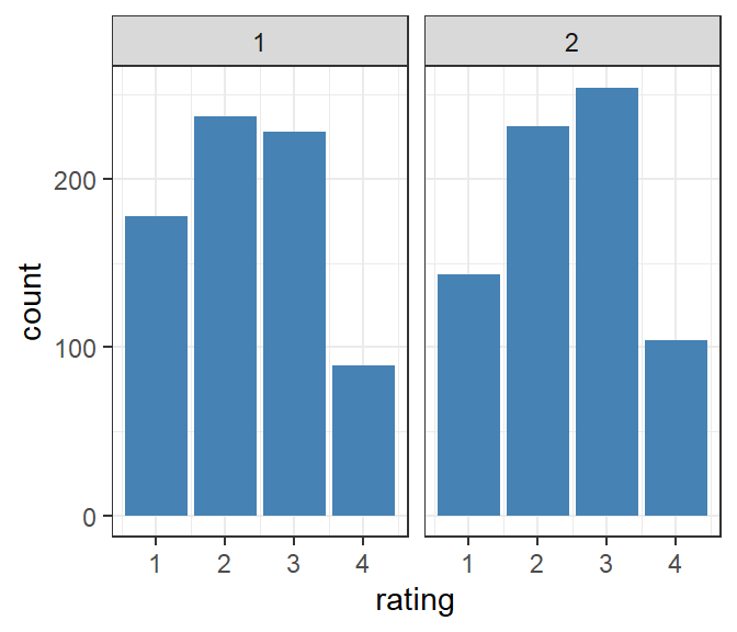
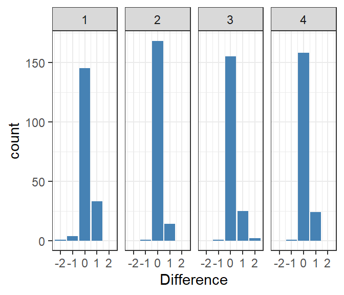
The counts of ratings over both trials shows that there were significantly more ratings of 1 in the first trial. The general question of interest here is whether or not we can consider the two trials to be independent draws from a common distribution, or if there was some change between the two trials. The design was intended to minimize the latter factor. Another measure of variability is the difference in ratings per vintage across the two trials by rater.
Figure 2: Difference in ratings between trials by judge.
Figure 2 shows that most differences in subject average rating (trial 2 minus trial 1) were small, and that the ratings tended to increase for trial 2. Note, however, that the two trials were interwoven, not sequential, so I don’t think we can say that judges became more lenient over time.
2 Independence
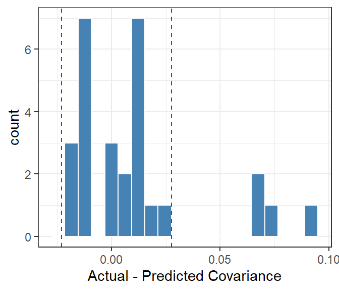
Can we just combine the two trials as one data set? The basic t-a-p model doesn’t have an extra accommodations for multiple ratings of a subject by the same rater. These would be treated like any other rating, assumed independent of all other ratings. We can test for independence with the covariance test, to see if combining the trials runs into a problem there. As an example, I’ll use the 1|2 cut point, so that ratings of 1 are Class 1 and ratings of 2-4 are Class 0.
Show the code
# trial 1cutpoint =1rating_params1 <- wine1 |>as_binary_ratings(cutpoint) |>fit_ratings() # get rater covariancescov1 <- rating_params1 |> tapModel::rater_cov()# get predicted range of covariance from trial 1range1 <- tapModel::rater_cov_quantile(rating_params1)# trial 2rating_params2 <- wine2 |>as_binary_ratings(cutpoint) |>fit_ratings() # get rater covariancescov2 <- rating_params2 |> tapModel::rater_cov()# get predicted range of covariance from trial 2range2 <- tapModel::rater_cov_quantile(rating_params2)# average these range <- (range1 + range2)/2# now all togetherwine |># make the second trial look like different ratersmutate(rater_id = rater_id + (trial -1)*10) |>as_binary_ratings(cutpoint) |>fit_ratings() |>rater_cov() |>plot_rater_cov(range, bins =20)
Figure 3: Covariances of raters on the whole data set, with expected range marked.
The outliers in Figure 3 suggest that treating repeat ratings as independent is a bad assumption. The approach here seems crude compared to an ANOVA, which can precisely parcel out contributions to variance, but the covariance plot is more general in that it might spot non-independence that we can’t identify the cause of. This shouldn’t be surprising given the obvious self-consisantcy of ratings in Figure 1.
It seems best to either consider the two trials as draws from a distribution, or combine them in a way that avoids violating independence.
3 Ordinal Parameters
There’s a helper function in fit_ordinal_tap(ratings) for ordinal scales, which you can see employed in the code below. The idea is to convert the ordinal scale into a sequence of binary scales by using cut points between the rating values. A cut point of 2|3, for example, separates the 1 and 2 ratings into Class 1 and the 3 and 4 ratings into Class 0.
Show the code
wine1_params <-fit_ordinal_tap(wine1) |>filter(type =="t-a-p") |>mutate(trial =1) wine2_params <-fit_ordinal_tap(wine2) |>filter(type =="t-a-p") |>mutate(trial =2) rbind(wine1_params, wine2_params) |>select(trial, CutPoint, t, a, p, ll) |>mutate(rll =expected_bits_per_rating(params =list(t = .5, a = a, p = p))) |>kable(digits =2, format ="html", escape =FALSE) |>kable_styling(full_width =FALSE, # <- stops spanning the full pageposition ="center",bootstrap_options =c("striped","hover","condensed") )
Table 1: Ordinal coefficients for rating cut points, where ll is expected log likelihood given the parameters, and rll is the same but with t = .5 to represent balanced classes, isolating the entropy from just the raters.
trial
CutPoint
t
a
p
ll
rll
1
1|2
0.26
0.54
0.22
0.59
0.70
1
2|3
0.54
0.44
0.59
0.84
0.85
1
3|4
0.71
0.26
0.94
0.45
0.58
2
1|2
0.27
0.60
0.09
0.42
0.59
2
2|3
0.59
0.60
0.38
0.73
0.71
2
3|4
0.87
0.59
0.84
0.43
0.64
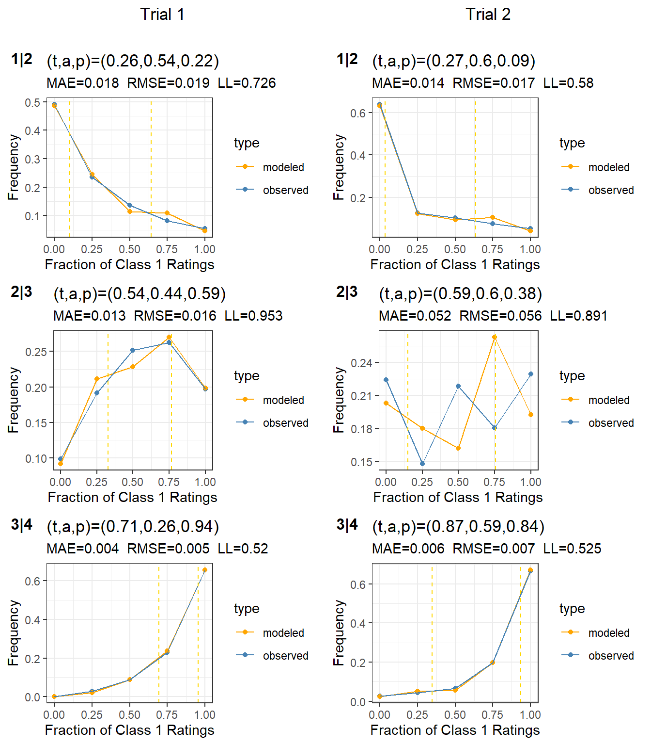
The parameter estimates Table 1 are not stable between the two trials, which casts doubt on the model fit generally. There’s either some source of variance not accounted for, or the sampling assumptions aren’t being met.
Figure 4: Subject calibration for the three cut points. Trial 1 is in the left column, with cut points 1|2 through 3|4. Trial 2 is in the right column with same cut points.
The subject calibrations in Figure 4 is quite good for all except for the 2|3 cut point for trial 2, which is a poor fit.
4 Combined Data
In this data we have a direct way to assess rater accuracy, by comparing ratings of the same subjects between trials. We saw in Figure 1 that a high proportion of raters found the same classification between trials. This could be either because of reliability in the rating assignments, or a violation of independence whereby raters recognize a wine they’ve tasted before. I don’t know how likely that is, but it’s conceivable that if a rater can identify a vintage, they might assign a rating from memory.
To attempt to improve data quality it seems reasonable to just keep cases where raters agree with themselves on a particular wine, and discard ratings where they disagree with themselves. This imagines a new protocol for the wine judging, where after the two trials, any ratings where an individual judge didn’t agree with him/herself is tossed out. Since we are only taking one rating per judge-wine combination, we shouldn’t have an independence problem.
Show the code
wine_clean <- wine |>spread(trial, rating) |>filter(`1`==`2`) |>select(subject_id, rating =`1`, rater_id)wine_clean_params <-fit_ordinal_tap(wine_clean) |>filter(type =="t-a-p") wine_clean_params |>select(CutPoint, t, a, p, ll) |>mutate(rll =expected_bits_per_rating(params =list(t = .5, a = a, p = p))) |>kable(digits =2, format ="html", escape =FALSE) |>kable_styling(full_width =FALSE, # <- stops spanning the full pageposition ="center",bootstrap_options =c("striped","hover","condensed") )
Table 2: Ordinal coefficients for rating cut points, where ll is expected log likelihood given the parameters, and rll is the same but with t = .5 to represent balanced classes, isolating the entropy from just the raters.
CutPoint
t
a
p
ll
rll
1|2
0.28
0.62
0.10
0.42
0.58
2|3
0.64
0.63
0.22
0.70
0.64
3|4
0.90
0.72
0.63
0.50
0.57
Generally, Table 2 shows higher accuracy and lower entropy. Let’s look at the subject calibration.
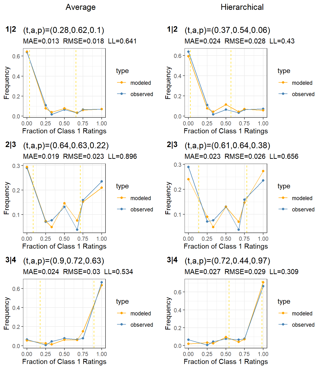
Figure 5: Subject calibration for the three cut points on the cleaned data. The average t-a-p model is in the left column, with cut points 1|2 through 3|4. The hierarchical model is in the right column.
The distributions in Figure 5 look better than the trials taken individually in Figure 4. We want “bumps” in the distribution, because that’s a sign of the binomial mixture separating the two means (meaning larger accuracy). Notice that the model fits the 2|3 case better here than in trial 2. Also, the average parameter estimates are significantly different, especially for the 3|4 cutpoint, where the bias (\(p-t\)) changes direction.
Given the significant gains in log likelihood, the reasonableness of individual variation by raters, and additional bonus of gaining rater and rating calibration, should we use the average model or the hierarchical one for the next step? This is a subjective decision, but it amounts to a choice about what we think is the most reasonable distribution of true ratings.
Show the code
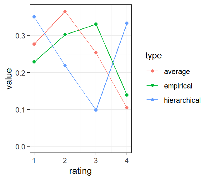
# we need to estimate all the parameters for the three hierarchical modelswine_clean_params <- wine_clean_params |>select(t, a, p)t_results <-vector("list", 3)a_results <-vector("list", 3)for(i in1:3){ rating_params <- wine_clean |>as_binary_ratings(in_class =1:i) |>fit_ratings() t_results[[i]] <- rating_params |>distinct(subject_id, .keep_all =TRUE) |>mutate(cutpoint =str_c(i,"|",i+1)) |>select(cutpoint, subject_id, t) a_results[[i]] <- rating_params |>distinct(rater_id, .keep_all =TRUE) |>mutate(cutpoint =str_c(i,"|",i+1)) |>select(cutpoint, rater_id, a,p) }t_results <-bind_rows(t_results)a_results <-bind_rows(a_results)empirical <- wine_clean |>count(rating) |>mutate(p = n/sum(n)) |>pull(p)t_avg <- t_results |>group_by(cutpoint) |>summarize(t =mean(t)) |>pull(t)average_model <-with(wine_clean_params, c(t[1], t[2] - t[1], t[3] - t[2], 1- t[3]))hierarchical_model <-c(t_avg[1], t_avg[2] - t_avg[1], t_avg[3] - t_avg[2], 1- t_avg[3])t_compare <-data.frame(rating =1:4, empirical = empirical, average = average_model, hierarchical = hierarchical_model)t_compare |>gather(type, value, -rating) |>ggplot(aes(x = rating, y = value, group = type, color = type)) +geom_line() +geom_point() +theme_bw() +ylim(0,NA)
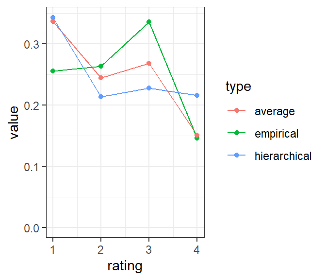
Figure 6: Rating distributions, comparing the average model, hierarchical model, and empirical ratings after cleaning.
We can think of Figure 6 as a kind of scale calibration. Compare the average model and empirical rating distributions (red and green). There, the model is asking us to believe that the ratings are slightly inflated; there should be somewhat more ratings of 1 and 2 and fewer of 3 and 4. The hierarchical model, by contrast wants to turn the distribution upside down, saying that both the 1s and 4s are underrepresented in the actual ratings. Subjectively (to me) this seems unreasonable, and is probably a sign of overfitting the data with too many parameters.
As a result of this intuition, I’ll use the average model for the rest of the analysis.
5 Wine Ratings
Now that we have a reasonable model of the ratings, we can ask about the qualities of the individual wines; what rating should we assign based on the model’s parameters in combination with the ratings? We can do that by using the E-step of the E-M algorithm to assign \(t_i\) ratings to each subject using the average parameter estimates. To assign ratings from the ensemble of three models is a bit awkward, and we might think about either a true categorical method like MACE or an explicit ordinal t-a-p model, which will require more development. I’ll stick with what we’ve got for now, using the average model to estimate \(t_i\) for each wine at each cut point. This is found in Figure 7.
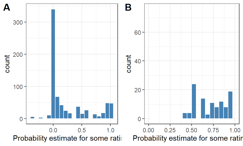
Figure 7: Histogram of (A) all induced probabilities for each subject to have a given rating, and (B) the probability of the most likely rating.
The results in Figure 7 show the limitations of cobbling together three binary models instead of having a true ordinal model, e.g. some of the computed probabilities are negative in figure A. However, there are few of these, and the distribution of probabilities in (A) shows a clearly-defined mixture distribution, even though it complicated with a cluster around .5. The probabilities for the ratings 1-4 will not generally sum to one for a given subject in this ensemble model. However, we can still get some use out of the results by finding the most likely rating per subject, and then insisting on some level of estimated confidence. The histogram of probabilities for these most likely ratings (B) has most of the cases with 70% or more probability. I’ll use a threshold of 70% probability to classify a wine into a given rating. For subjects that lack that level of confidence, I’ll call it “complex” to indicate a lack of agreement.
Table 3: After classifying wines by the modeled probabilities, show the counts, average ratings, and standard deviation of ratings in each group. “Complex” means there wasn’t enough agreement to assign a rating using a 70% probability threshold.
model_rating
wines
avg
sd
1
43
1.33
0.61
2
32
2.39
0.58
3
37
3.01
0.49
4
22
3.80
0.45
Complex
49
2.41
0.88
The figures in Table 3 show that most of the wines can be classifed by the model using the probability threshold, and that the rating averages look as expected. The standard deviation of the “complex” group is high, as we’d expect. In a real judging event, it’s probably not acceptable to classify so many vintages as unratable, but it would increase the validity of the ratings and might add an interesting element. What does it mean in practice for wine judges to find no agreement? It’s qualitatively different from the ordinal rating scale, but do we really expect a single dimension to capture the complexities of wine?
I tried a dimensionality analysis using the singular value decomposition on the wine ratings by subject and by rater to see if there was a relationship between the singular vectors and the classification as a complex wine. The results were suggestive, but only if I squint and hope for the best. The connection between the factor 1 loading and the probabilities were not clear enough to include here. I thought that the complex wines might have loadings on the first component that were more extreme than the average, but I didn’t find that pattern. There are other types of dimensional analysis, which might lead down a forking path to an explanation.
6 Evaluating Raters
Given the final model ratings, we can hope to assess the qualities of the raters using the statistics so far.
Table 4: Wine judge statistics, showing the number of non-complex wines rated, their match rate with the model, the average rating - model_rating difference, and their self-match rate in the full data set with two trials.
rater_id
rated_wines
model_match
rating_diff
self_match
1
109
0.79
0.17
0.79
2
126
0.67
0.22
0.92
3
118
0.73
0.19
0.85
4
121
0.78
0.17
0.86
Table 4 shows that the raters are similar in their performance; they each matched ratings for the same wine at a high rate, and also matched the non-complex wine ratings at a high rate. The difference column show (again) that the raters slightly inflate ratings compared to the fitted average t-a-p model.
7 A Final Model
I can’t resist running one more filter, to remove the “complex” wines, just to see how well the model fits.
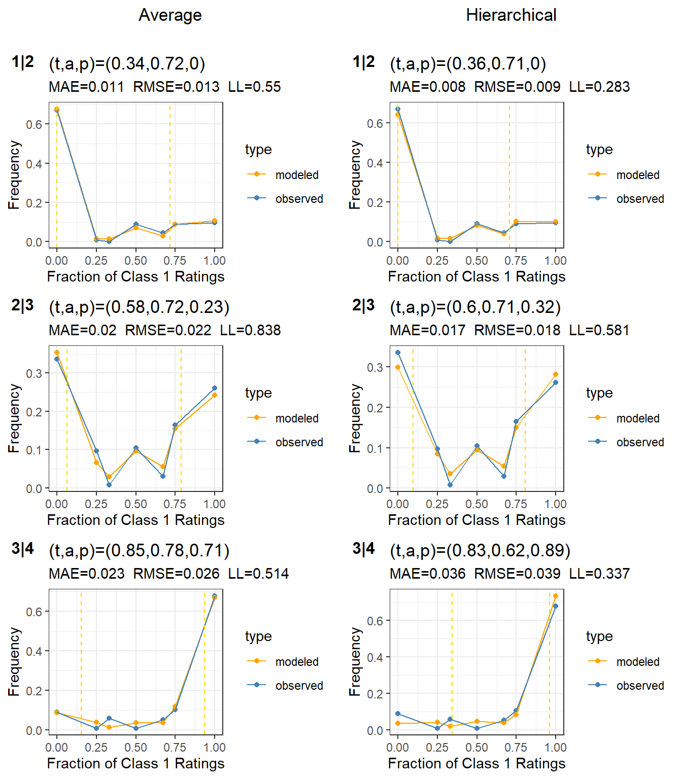
Figure 8: Subject calibration for the three cut points on the cleaned data with complex cases removed. The average t-a-p model is in the left column, with cut points 1|2 through 3|4. The hierarchical model is in the right column.
The average and hierarchical models agree well on the average parameters, and the entropy has decreased again except for the bottom right plot, where the hierarchical model got slightly worse. I think we could trust the hierarchical model here to give us rater information. Let’s look at the scale calibration again.
Figure 9: Rating distributions, comparing the average model, hierarchical model, and empirical ratings after cleaning and de-complexifying.
This time (compare with Figure 6) there’s nothing obviously wrong with the hierarchical model.
Show the code
model_results |>distinct(cutpoint, rater_id, a, p) |>kable(digits =2, format ="html", escape =FALSE)
Table 5: Rater statistics after cleaning and removing complex cases, using the hierarchical t-a-p model at each cutpoint.
cutpoint
rater_id
a
p
1|2
1
0.65
0.00
1|2
2
0.54
0.00
1|2
3
0.79
0.00
1|2
4
0.84
0.00
2|3
1
0.79
0.27
2|3
2
0.74
0.33
2|3
3
0.61
0.44
2|3
4
0.70
0.24
3|4
1
0.60
0.96
3|4
2
0.49
0.89
3|4
3
0.75
0.77
3|4
4
0.63
0.93
The modeled \(p_j\) parameters in Table 4 say that when raters make inaccurate ratings at the end of the scale, they always favor the 1 rating and almost always favor the 4 rating. The mid-point 2|3 is more balanced. This pattern can be found in all the model estimates to some extent. I wonder if it’s a model limitation or a psychological effect, or perhaps is just peculiar to this data set for some reason.
8 Final Thoughts
More usual types of analysis on a data set like this are a preference model like proportional odds or a score variance model like ANOVA (hierarchical regression with some level of pooling). The lack of a true ordinal t-a-p model means it’s awkward to work with the cut points, and the dual trials added more complexity that a score variance model can easily accommodate. However, I think the t-a-p model adds a philosophical component that variance-based models don’t, viz addressing the question of a “true” rating. What would it even mean for a wine to have a true score?
As with any instrument, we can imagine a causal pathway whereby the inputs, comprising the appearance, aroma, and tastes of a vintage, lead predictably to a human assessment based on experience. Here the wine judge is the instrument. Humans can act reliably as causes if the conditions are right. A factory with human workers would be impossible otherwise. So it’s plausible that the judges have a reliable response to the perceived characteristics of the wine samples. It would be hard to explain the self-consistency of the repeated tastings otherwise. As noted earlier, this could be partly to recognition of samples and recall of the prior rating, rather than a true independent trial. That’s not a question we can answer with this data.
The winnowing process in the analysis here first consolidated the two trials, which is a rather drastic reduction in data. The second filter was to take out the wines with low-confidence probabilities for the modeled ratings. From the usual regression modeling perspective, this is a terrible idea; we don’t throw out samples unless they are clear outliers, and even then we want to think hard about it. However, we’re after something different here: the plausibility of metaphysical truth. This is because the t-a-p model assumption of a latent truth state is a strong assumption (strong means stringent in this context). The convergence of the average and hierarchical models for the last (most-reduced) data set makes me think that a “true wine rating” is not a crazy idea, but subject to some limitations. First we have to insist on high quality ratings, hence the first filter requiring identical ratings across trials. The models are clearly sensitive to noisy data. The second proviso is that the wine scale is but one dimension of the complexities related to wine quality, and therefore some of the wines are not likely to reach consensus. If we can swallow all that, then maybe the final ratings do have some connection to physical reality that starts with sense data, wends through a neurological classification, and ends up with a 1-4 rating or a separate category for unratable or complex wines.
References
Hodgson, R. T. (2008). An examination of judge reliability at a major US wine competition. Journal of Wine Economics, 3(2), 105–113.